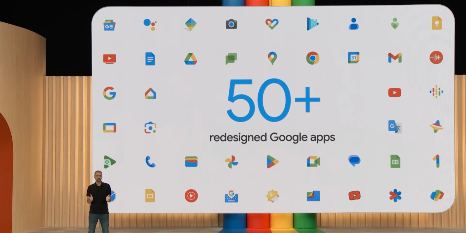
This is the semifinals of our best Google four-color app icon tournament.
1.) Google Maps vs. 5.) Google Photos
Google Maps beat Google Drive, and Google Photos overtook Calendar.
Both icons in this match-up have distinctive shapes, and people are well aware of each application.
4.) Chrome vs. 9.) Google Wallet
Chrome surpassed Gmail in a close race and seeding upset, while Google Wallet beat Files by Google by the biggest margin this round.
As such, all three Google Workspace icons are out. (There were five in this tournament: Chat, Meet, Drive, Calendar, and Gmail.) When the Workspace branding revamp happened in 2020-21, the company said the four-color icons helped make obvious the relationship to Google.
Going forward, it’s the circle versus the rectangle. Chrome’s icon is obviously, well, iconic, but I’d say Wallet does a better job of representing a physical wallet. The latter winning would be a real upset.
You can fill out the Google Form below, or here.
Each round will be open for approximately 24 hours, with the final happening on Saturday.

FTC: We use income earning auto affiliate links. More.

 2 hours ago
5






 English (US) ·