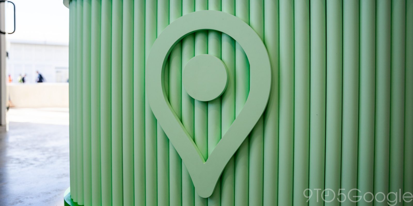
Like other first-party apps that lack Dynamic Color theming, Google Maps currently uses a blue accent for buttons and other UI elements, but that looks to be changing to teal.
Users are beginning to see a teal accent color that’s applied to the Google Maps bottom bar and icons like directions and location. Recent screenshots from Google Maps announcements have featured this new shade.
The teal accent is also very apparent when viewing listings, with Directions, Start, and other buttons in the carousel updated.
Old vs. new
It’s unclear why Google chose this more muted color that’s not really aligned with the company’s usual blue, red, yellow, and (bright) green palette. We’ve reached out to the company for more information.
This server-side change is not yet widely rolled out on Android or iOS, and follows the new color palette for the map layer introduced this time last year.
It follows other recent design changes like moving the corner weather widget to the bottom sheet, as well as the simplified bottom bar with just three tabs.
More on Google Maps:
- Google Maps getting Gemini search, review summaries, and Q&A
- Google Maps adding weather disruption reporting & more detailed driving map
- Google Maps now has over 2 billion monthly users
FTC: We use income earning auto affiliate links. More.
 1 week ago
2


 English (US) ·