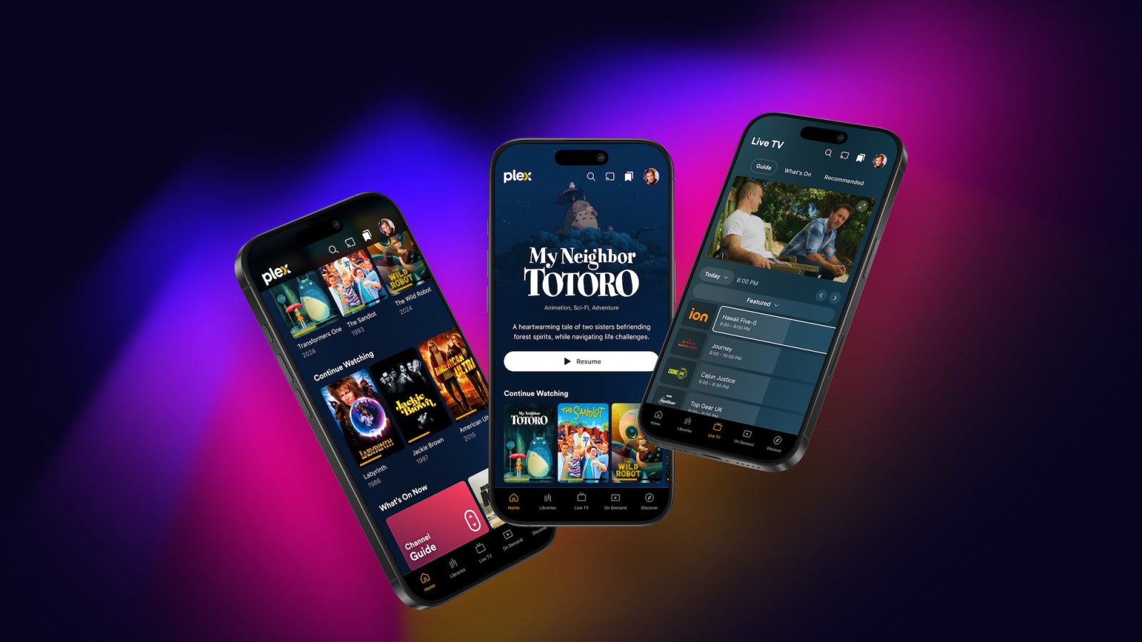
Plex has announced a big update coming soon to its iPhone app. The app features a dramatic redesign with changes to navigation, more artwork, and more. Structurally, the app has also been completely rewritten from the ground up.
The current focus is on the new mobile experience, but Plex says a revamped TV experience is coming “very soon.”
In a blog post, Plex explains that one of the focuses of the new design is revamping the navigation system:
One of the key changes is redesigned navigation that makes it easier to dive into the different parts of Plex and discover content with simplicity. Through extensive testing, we found that this new structure not only helps existing users navigate more intuitively but also gives new users a much clearer sense of what Plex is all about. We’ve brought our core features to the forefront, saying goodbye to the days of hidden hamburger menus and making it easier to explore with one hand on your phone.
Visually, the new Plex app features larger and more immersive artwork throughout the interface:
One of the standout elements of this redesign is the expanded use of artwork throughout the app, bringing visual richness and greater depth to your experience. You’ll notice this especially in movie and show detail pages, cast and crew profiles, and even your own personal profile page. We’ve also introduced title artwork for movies and shows where available—a long-requested feature that adds polish to each page. And we’re just getting started; expect even more enhancements here as we continue to evolve these pages to make them both beautiful and engaging.
In addition to the cosmetic changes and new features, Plex says this is also a major under-the-hood overhaul. The app has been rewritten from the ground up and unifies its platforms across a single codebase. This should enable faster development of updates and new features going forward.
For Plex users who manage their own media library, there is a dedicated “My Library” tab in the new Plex app. It does seem, however, that there’s a clear focus on pushing users toward using other features of Plex, such as its integration with other streaming services on the “Home” tab.
Plex knows this is a dramatic redesign, and it’s important to get the changes right. For that reason, the new design is available starting today as an early-access preview and will launch to the general public in 2025.
You can sign up to try the new app by heading to the Plex forums and joining the TestFlight. There’s also a page on the Plex website detailing features still missing from the new app, including casting, select download and offline features, and more.
Follow Chance: Threads, Bluesky, Instagram, and Mastodon.
FTC: We use income earning auto affiliate links. More.

 5 hours ago
2


![Google TV ads have giant QR codes now [Gallery]](https://i0.wp.com/9to5google.com/wp-content/uploads/sites/4/2024/11/google-tv-qr-code-4.jpg?resize=1200%2C628&quality=82&strip=all&ssl=1)


 English (US) ·